Plan

Introduction
In a world where smartphones and tablets have become an integral part of our lives, responsive website design is turning from a fashion trend to a critical necessity for any business that wants to succeed in the online space. creating your own business website, it is important to determine the platforms on which your project will work.

Section 1: What is responsive design and why does your business need it?
Imagine this: a potential customer hears about your company, opens your website on his smartphone… and is faced with an inconvenient interface, small text and the inability to find the information he needs. What impression will they have of your brand and will they come back to you again? This is where responsive website design comes in. It doesn’t just make your website look beautiful – it makes it a convenient and effective tool for attracting customers and growing your business. But what exactly does responsive website design for business mean, and how can it help you succeed in the digital age? Read on to find out!

1.1. User friendliness
In the digital age, your website is the face of your business in the online world. And just as you make sure your office or store is attractive and convenient, it’s important to provide a comfortable environment on your website as well. This is where responsive website design plays a key role.
Imagine two scenarios:
- Scenario 1: A potential customer searches Google for a service your company provides. He finds your website, opens it on his smartphone… and is faced with endless horizontal scrolling, small text that blends into one another, and buttons that are impossible to click. Frustrated, he closes your site and goes to your competitors.
- Scenario 2: The same customer lands on a website with a responsive design. All the information is structured, the text is easy to read, the photos are clear, and the buttons are intuitive. He easily finds the information he needs, contacts and a feedback form. Satisfied with the service, he becomes your client.
Which scenario is closer to your reality?
Responsive website design ensures that your site looks flawless and functions properly on any device:
- Desktop computers: your website will look professional and presentable on large screens.
- Laptops: responsive design will ensure optimal display of content on medium-sized screens.
- Tablets: your site will be easy to navigate and read on touch screens.
- Smartphones: users will be able to easily find the information they need and contact you, even if their phone screen is all they have at hand.
Responsive website designis not just a fashionable feature, it is an investment in the comfort of your users, and therefore in the success of your business.
Examples of responsive website design can be found on the websites of the world’s leading companies, such as Apple, Google, Amazon, and many others.
Continued in the next paragraph.

1.2. Impact on business results
User experience is great, but how does responsive website design affect specific business metrics? The answer is simple: directly and positively.
Here are just a few examples of how responsive website design can benefit your business:
- Increase conversion rate: When users are comfortable interacting with your site, they are more likely to perform the target action: make a purchase, fill out an application form, subscribe to a newsletter, etc.
- Increase sales: A user-friendly website means happy customers, and happy customers mean increased sales. Responsive design helps to turn website visitors into loyal customers.
- SEO Improvement: Google and other search engines prefer websites with responsive design. This means your site will rank higher in search results, which means more potential customers will find you online.
- Strengthening the brand image: A modern, responsive website shows that you care about your customers and keep up with the times.
- Cost savings: Instead of developing a separate mobile version of the site, you invest in one universal design that works on all devices.
In other words, responsive website design is not just a fashion trend, it’s a smart investment in the future of your business.
In the next section, we’ll take a closer look at the features of responsive design and its key benefits.

Section 2: Features of responsive design and its benefits
We’ve already established that responsive website design is not just a fashion fad, but a necessity for any business that wants to attract and retain customers in the online world. But what exactly makes it so special? What unique characteristics distinguish it from other approaches to web development? And, most importantly, what benefits will you get by choosing a responsive design for your website? In this section, we will dive deeper into the essence of responsive design, consider its main advantages, and understand why it is the best solution for modern business.
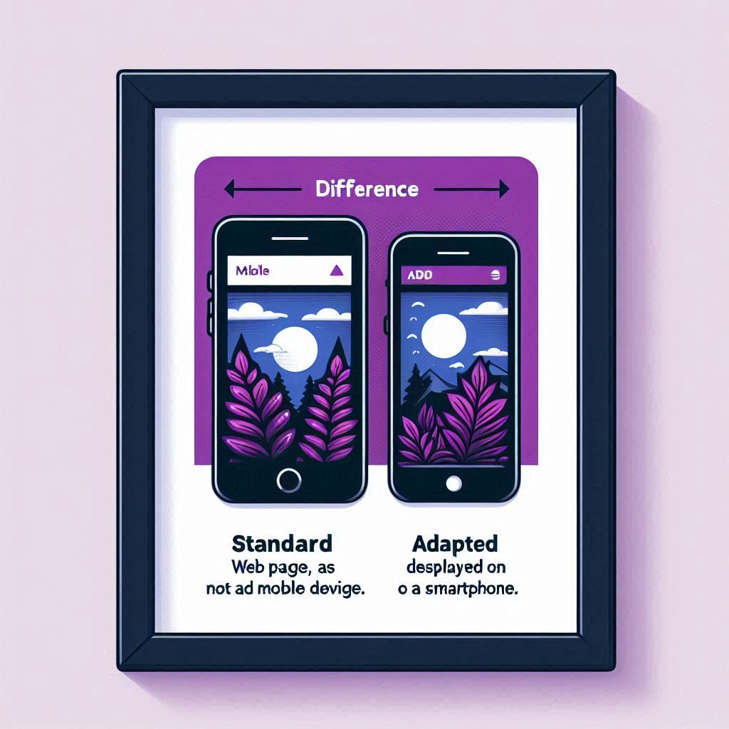
2.1. Responsive design vs. mobile version
There is often confusion between the concepts of “responsive design” and “mobile-friendly design”. Although both options are aimed at improving the user experience on mobile devices, there are significant differences between them.
A mobile version of a websiteis essentially a separate website created specifically for viewing on smartphones and tablets. It has an incremental address (e.g. m.yoursite.com) and contains a limited number of pages and features compared to the main site. Although a mobile version can be a quick and inexpensive solution, it has a number of disadvantages:
- Limited functionality: Mobile versions of websites usually offer fewer features than the main site, which can be frustrating for users who are used to the full version.
- Content duplication: Since the mobile version of the site is a separate resource, you will have to duplicate content, which complicates site management and can negatively affect SEO.
- Problems with redirects: Users may be directed to the wrong version of the site if the redirect mechanism is not configured correctly.
Adaptive design, unlike the mobile version, is the only website that automatically adapts to the screen size of any device. This is achieved thanks to a flexible grid, flexible images, and CSS media queries that allow you to change the location of site elements, font size, and other parameters depending on the screen resolution.
The benefits of responsive designare obvious:
- A single site for all devices: You only manage one site, making it easy to update content, analyse traffic, and optimise SEO.
- Improved SEO: Search engines favour websites with responsive design because they provide a better user experience across all devices.
- Saving money and time: Developing and maintaining a single website with a responsive design is cheaper and faster than creating and maintaining separate versions for different devices.
In today’s digital world, where the number of mobile users is constantly growing, responsive design is not just an advantage, but a necessity for a successful online business, just like how to choose the right domain, or how to choose a hosting.
Next, we’ll look at the key benefits of responsive design in more detail

2.2. Ключові переваги адаптивного дизайну
By choosing a responsive website design, you invest not just in a modern look, but in a whole range of benefits that will positively affect your business. Let’s take a closer look at what makes responsive website design so attractive for mobile devices and beyond:
- Improve SEO and increase search rankings: Google and other search engines prefer websites with a responsive design. Why? Because they provide a better user experience regardless of the device. And the better the user experience, the higher your site’s position in search results, and therefore, the more potential customers will find you.
- Increase conversion and sales: A user-friendly website encourages users to perform targeted actions: make purchases, order services, and seek advice.
- Saving money and time: Instead of developing and maintaining separate versions of your website for different devices, you get one universal website that adapts to any screen. This will save you not only money but also time.
- Convenient content management: All updates and changes to the site are made only once and are displayed on all devices. This greatly simplifies the work with content and reduces the risk of errors.
- Positive impact on brand image: A modern, cross-device website shows your customers that you care about their comfort and are up-to-date.
Adaptive website design is inexpensiveIt is a myth. It is not cheaper than developing separate versions of a website for different devices. However, considering all its advantages and long-term perspective, it is an investment that will quickly pay for itself and bring you a significant profit.

Chapter 3: How to choose a team to create a responsive design?
You already know that responsive website design is the key to the success of your business in the online world. Now it’s time to find a reliable partner who will bring your ideas to life and create a website that will work for you 24/7, attracting new customers and increasing your profits.

3.1 Responsive design services: what to look for?
Choosing a responsive design company is like choosing a construction team to renovate your apartment. You wouldn’t entrust this work to the first people who appeared in an advert, would you? It’s the same with a website: not only the appearance of your online resource, but also its functionality, user-friendliness, and, as a result, the success of your online business depend on the professionalism of the developers.
Here are some important questions you should ask potential contractors to make sure they are really capable of creating a high-quality responsive website design for you:
- What is your experience in developing responsive websites? Feel free to ask about specific projects, deadlines, and challenges that developers have faced.
- Can I see your portfolio? Browse through the examples of work, pay attention to the design, usability and functionality of the sites.
- Do you take into account the peculiarities of the target audience when developing the design? It is important that the site is not only beautiful, but also understandable and interesting for your potential customers.
- What tools and technologies do you use to create responsive websites? Make sure that the company uses modern technologies that guarantee the speed, security, and SEO friendliness of the site.
- How will our cooperation be organised during the project implementation? It is important to clearly understand the stages of development, deadlines and cost of work.
- What support do you provide after the launch of the website? Learn about the possibilities of further support, website updates and elimination of possible errors.
3.2. How to create the perfect responsive design for your business: stages and nuances
Development of responsive website designis not just about drawing beautiful pictures, but a complex process that requires a professional approach and attention to detail. Here are the key stages of this process:
- Analysis and planning:Before you start designing, you need to carefully study your business, target audience, competitors, and set clear goals that the site should achieve.
- Prototype development:At this stage, a schematic image of the site is created, its structure, navigation and location of the main elements are determined.
- Design and layout:Based on the approved prototype, we develop a unique website design that meets your brand and user needs.
- Programming:The layout of the site is turned into a working code, animation, interactive elements and other functionality are added.
- Testing and launch:Before launching, the site is thoroughly tested on different devices and browsers to make sure it works correctly and without errors.
It is important to remember:
- Adaptive design is not a one-time action, but an ongoing process.Technologies are evolving, new devices and web design trends are emerging. To keep your website modern and effective, you need to regularly update and optimise it.
- Your participation in the development process is extremely important.Clearly state your wishes, participate in discussions, and don’t be afraid to make adjustments. After all, this is your website, and you should like it and work effectively for your business.
To check the responsive design of your website, you can use special online services or simply resize the browser window. If the elements of the site are correctly scaled and adapted to different screen sizes, then everything is working correctly.
Remember: creating an adaptive website design is an investment in the future of your business. And the success of your online project depends on how professionally this work is done.

Conclusion
In the world of mobile technology, responsive website design is not just a trend, but a vital necessity for any business that wants to succeed online. It provides a seamless user experience across all devices, increases conversion, improves SEO performance, and builds a positive brand image.
If you want your website to attract new customers and generate revenue, invest in a responsive design. Choose a reliable partner such as Duli.online and create a turnkey website that will work for you 24/7.
Frequently Asked Questions
-
Есть ли смысл инвестировать в адаптивный дизайн, если мой сайт и так неплохо смотрится на смартфоне?Does it make sense to invest in responsive design if my website already looks good on a smartphone?
Even if your website looks “good” on a smartphone screen at first glance, it doesn’t mean that it is really convenient and effective for mobile users. Here are some aspects to consider:
- “Not bad” doesn’t mean “perfect.” Perhaps the text on your website is readable on a smartphone, and the images more or less fit on the screen. But is it convenient for users to click on the buttons? Do the pages load quickly? Is it easy to find the information you need? Responsive design takes into account all the nuances of interaction with the site on different devices, providing the most comfortable user experience.
- Diversity of mobile devices.Today there are a huge number of smartphones and tablets with different screen sizes, resolutions and operating systems. Just because your website looks “good” on your iPhone doesn’t guarantee that it will look as good on a budget Android smartphone. Responsive design automatically adjusts to any device parameters, ensuring correct display on all gadgets.
- Behavioural factors and SEOGoogle and other search engines pay a lot of attention to behavioural factors: time spent on the site, browse depth, bounce rate, etc. If users find it inconvenient to use your website on a smartphone, they will quickly leave it, which will negatively affect your website’s ranking in search results. Responsive design helps to improve behavioural factors and increase the site’s position in Google.
- Competition.If your website is not adapted for mobile devices, you risk losing a significant part of potential customers who are increasingly using smartphones to search for information and make purchases online. Your competitors who have already taken care of responsive design will gain a competitive advantage.
Verdict: Investing in responsive design is not a luxury, but a necessity for any business that wants to stay competitive in the modern digital world. Even if your site looks “good” on a smartphone now, responsive design will help you take it to a whole new level, provide maximum user comfort, and improve key business metrics.
-
Is it true that responsive website design improves SEO? How does Google evaluate website responsiveness?
Yes, it’s true. An adaptive website design directly affects its SEO and position in Google search results.
Google makes it clear that it prefers mobile-friendly websites. This is due to the fact that the search engine strives to provide users with the most relevant and comfortable search results.
How does Google evaluate responsiveness?
- Mobile-first indexing:Since 2019, Google has been using mobile-first indexing as the main method of indexing websites. This means that the search engine crawler primarily analyses the mobile version of the site, and the position of the site in the search results depends on it. Responsive design essentially makes the site a single entity that is perfectly displayed on all devices, and this is fully in line with the principles of mobile-first indexing.
- Core Web Vitals: Google takes into account the speed of page loading, interactivity and visual stability of the site on mobile devices. A responsive design optimised for these indicators will receive higher scores from Google.
- Usability:Although Google does not disclose all ranking algorithms, it is known that the search engine analyses behavioural factors: time spent on the site, number of page views, bounce rate, etc. Responsive design improves the user experience, which has a positive impact on these indicators and, as a result, on SEO.
In addition, it has a responsive design:
- Eliminates the need to create a separate mobile version of the site,which simplifies the process of optimising and avoiding duplication of content.
- Improves the perception of the site by search engines, as Google gets access to a single code and URL of the site.
Conclusion: Responsive design is not just a fashionable feature, but anecessity for successful SEO promotion. If you want your website to rank high on Google and attract more customers, take care of its adaptability.
-
I run a small business and I can't afford an expensive website. Is responsive design available for a limited budget?
This question is on the minds of many small business owners. And the answer is definitely yes: adaptive website design is available even for a limited budget.
Of course, developing a website from scratch with a responsive design can be costly. However, there are several options that can help you get a modern responsive website without spending a lot of money:
- Using a CMS with responsive templates:
- WordPress:The most popular CMS in the world offers many free and paid templates with responsive design.
- Joomla, Drupal, OpenCart:Other popular CMSs also have a wide range of responsive themes that can be customised to suit your business needs.
Profiles:Fast launch, affordable price, large selection of options.
- Website designers:
- Wix, Tilda, Squarespace:Online builders allow you to create simple websites with responsive design without programming knowledge.
- Advantages:Ease of use, intuitive interface, affordable rates.
- Turning to freelancers or small web studios:
- Freelancers and small teams often offer more affordable prices than large web studios.
- Important:Carefully study the portfolio and reviews before entrusting your project.
- Focusing on what matters most:
- Even if you have a limited budget, focus on the responsive design of the key pages of your website: the home page, the services/products page, and the contact page.
It is important to remember:
- Don’t skimp on quality.A cheap website can cost you more in the future if it works with errors or looks unprofessional.
- Discuss the budget from the very beginning.Clearly define your financial capabilities and find the best solution together with the developers.
Don’t be afraid to contact specialists and look for the best options. Today, responsive website design is available to every business, regardless of its size and budget.
-
Why is responsive design better than the mobile version of a website? Isn't it easier to create a separate website for smartphones?
Although creating a separate mobile version of your website (m.yoursite.com) was once considered a good solution, today responsive design has undeniable advantages. Let’s take a closer look at why:
- User experience (UX):
- Adaptive design:The site smoothly adjusts to any screen size, providing an equally comfortable experience on all devices.
- Mobile version:Users may end up on the wrong version of the site (main instead of mobile or vice versa) due to incorrect redirection, which is annoying. In addition, the functionality of the mobile version is often limited compared to the main site.
- SEO optimisation:
- Responsive design:Google prefers websites with responsive design because it makes indexing easier and improves behavioural factors.
- Mobile version:Duplicate content on two different sites can lead to SEO problems. Google may consider this as low-quality content or an attempt to manipulate search results.
- Website management:
- Responsive design:You manage only one site, which greatly simplifies content updates, analytics, and technical support.
- Mobile version:You have to make changes to two separate sites, which requires more time and resources. In addition, there is an increased risk of inconsistency of information on different versions of the website.
- The cost of development and support:
- Responsive design:Although the initial development cost may be slightly higher than for the mobile version, the subsequent support is cheaper because you work with one site.
- Mobile version:You need to pay for the development and maintenance of two separate sites, which can end up costing more.
- Future:
- Adaptive design:This approach meets the modern requirements of web development and is focused on the future, where the number of mobile users will only grow.
- Mobile version:This approach is gradually losing its relevance and may negatively affect your site in the future.
Conclusion: Creating a separate mobile version of a website is an outdated approach that creates more problems than benefits. Adaptive design is the only right solution for modern businessthat provides user comfort, improves SEO, and simplifies website management.
-
How do I know if my website is mobile-friendly? What tools are available to check responsiveness?
There are several simple ways to check if your website is mobile-friendly:
- Change the size of the browser window:
- Open your website in a web browser on your computer.
- Start reducing the width of the browser window to simulate different screen sizes.
- If the elements of the site smoothly adjust to the new size, the text remains readable, and the images do not “move apart”, this is a good sign.
- Pay attention to: horizontal scrolling (it shouldn’t be there!), the size of buttons and links (is it convenient to click on them?), and the readability of the text.
- Use online tools:
There are many free services that can help you quickly and easily check the responsiveness of your website:
- Google Mobile-Friendly Test: An official tool from Google. Just enter the URL of your website and get a detailed report on its responsiveness.
- Responsinator: It shows how your website will look on the screens of different devices (smartphones, tablets, laptops).
- BrowserStack: It offers the possibility to test the website in real browsers on different mobile devices.
- CrossBrowserTesting: Another popular service for cross-browser and responsiveness testing.
- Check the website on real devices:
- Open your website on different smartphones and tablets with different operating systems (Android, iOS).
- Make sure the navigation is easy, the content is displayed correctly, and the forms are easy to fill out.
What to do if the website is not adapted?
- Don’t panic! This is a common problem that can be solved.
- Contact web developers who specialise in responsive design.
- The sooner you do this, the better it is for your businessbecause an unadapted website can cost you lost customers and low rankings on Google.
-
What are the most common mistakes companies make when creating a responsive design? What should you look for to avoid wasting money?
Responsive design is not just a fashion fad, but a necessity for a successful online business. However, some companies, in an effort to save money or lack of experience, make common mistakes that negate all the benefits of responsiveness.
Here’s what you should pay attention to so you don’t throw your money away:
- Neglecting the needs of users:
- Problem:The site is technically adapted, but inconvenient for mobile users: too small text, unclickable elements, too many pop-ups, slow loading.
- Solutions:Put yourself in the shoes of a smartphone user. Make sure that the navigation is intuitive, the text is easy to read, and the buttons are big enough to press with your finger.
- Ignoring the download speed:
- Problem:The site takes a long time to load on mobile devices due to “heavy” images, an excessive number of scripts, and unoptimised code.
- Solutions: Optimise images, minimise HTML, CSS and JavaScript, use browser caching, choose fast hosting.
- Unadapted forms and pop-ups:
- Problem:Registration/order forms or pop-ups are not adapted for mobile devices and block access to the main content.
- Solution:Use responsive forms with large text input fields, minimise the number of fields, avoid pop-ups that worsen the user experience on smartphones.
- Improper use of images:
- Problem:Using images that are too large, which slows down loading, or vice versa, too small, which looks blurry on high-resolution screens.
- Solution:Use the srcset attribute to load different versions of images depending on the screen size, optimise file size, use modern image formats (WebP).
- Neglect of testing:
- Problem:The site is not tested on different mobile devices and browsers, which leads to display errors and functionality issues.
- Solution:Thoroughly test your website on different smartphones, tablets, operating systems, and browsers. Use online services to test responsiveness.
Remember:
- Clearly formulate your requirements for developers.Discuss all the details, show examples of sites you like.
- Don’t be afraid to ask questions.If you don’t understand something, don’t hesitate to ask.
- Require a guarantee.Make sure that the developer will provide technical support and eliminate possible errors after the site is launched.
By investing in responsive design, you are investing in the future of your business. A careful approach and attention to detail will help you get a website that will work for you 24/7, attracting new customers and increasing your profits.